

Your Complete Guide to Shopify Banner Sizes in 2026

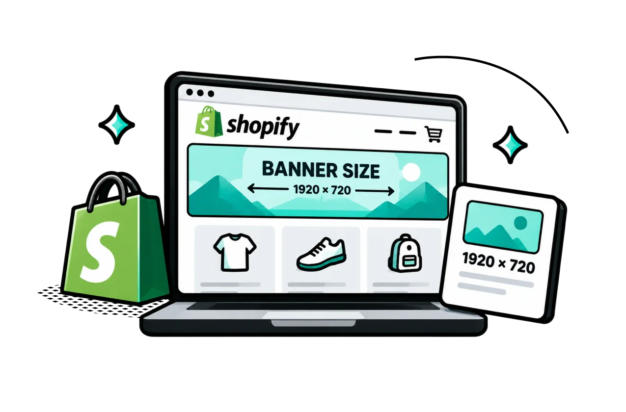

Table of Contents
Choosing the right Shopify banner size can be trickier than it looks. A banner that works well on your homepage may not fit the same way on a collection page or mobile screen.
There’s no single size that works for every Shopify store, so the key is matching your image dimensions to the section, theme, and way shoppers view it. This guide covers practical Shopify banner sizes, image optimization tips, and design advice to help your banners look good without slowing down your store.
In this blog:
Choosing the Right Banner Size for Each Placement
There’s no single banner size that works perfectly for every Shopify store. Shopify themes can display and crop images differently depending on the section and screen size, so the right dimensions depend more on the banner’s placement and aspect ratio than on one fixed pixel size.
As a practical starting point, you can use the following dimensions for common banner placements:
Banner Type | Desktop Dimensions (W x H) | Mobile Dimensions (W x H) | Aspect Ratio |
|---|---|---|---|
Homepage Hero / Large Banner | 1920 x 1080 px | 800 x 1200 px | 16:9 |
Standard Website Banner | 1200 x 400 px | 360 x 120 px | 3:1 |
Slideshow Banner | 1920 x 1080 px | 1200 x 400 px | 16:9 |
Image with Text Overlay | 1800 x 1000 px | 1200 x 800 px | 16:9 |
Collection Page Banner | 1200 x 600 px | 800 x 600 px | 2:1 |
These are starting points rather than fixed Shopify requirements. Your theme may use different layouts or cropping behavior, so always preview the final banner on both desktop and mobile before publishing.
1. Homepage Hero Banner or Slideshow

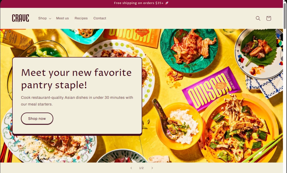
A homepage hero banner is the large visual section shoppers typically see near the top of your Shopify store. It’s a good place to feature your main offer, featured product, new collection, or seasonal campaign and give shoppers a clear next step.
- Desktop: 1920 × 1080 px (16:9)
- Mobile: 800 × 1200 px (2:3)
- Tip: Keep the main product and important text away from the edges to reduce the risk of cropping. If your theme supports a separate mobile image, use one when the desktop composition doesn't translate well to a narrow screen.
2. Collection Banner
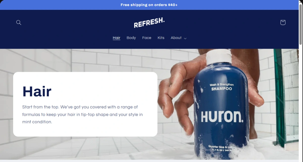
A collection banner sits at the top of a Shopify collection page and gives shoppers a quick visual introduction to the category they're browsing. Keep the design simple so the banner supports the product grid rather than competing with it.
- Desktop: 1200 × 600 px (2:1)
- Mobile: 800 × 600 px (4:3)
- Tip: Keep the banner relatively short and avoid placing too much text in the image. The collection and products should remain the main focus.
3. Promotional or Sale Banner
A promotional banner highlights a specific offer, discount, free shipping deal, or limited-time campaign across your store. Since shoppers often scan these quickly, the offer should be immediately clear.
- Desktop: 1200 × 400 px (3:1)
- Mobile: 360 × 120 px (3:1)
- Tip: Keep the message short and easy to scan. Make the offer and CTA visually prominent without adding unnecessary design elements.
4. Image With Text Overlay
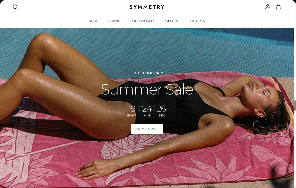
An image with text overlay combines a visual with supporting copy, making it useful for product education, brand storytelling, or highlighting a featured collection. The image should complement the message rather than carry too much information on its own.
- Desktop: 1800 × 1000 px (9:5)
- Mobile: 1200 × 800 px (3:2)
- Tip: Keep the main subject away from areas where the text appears, and make sure the overlay remains readable against the image.
- Tip: If your theme already places text beside or below the image, keep the image itself clean instead of adding the same copy directly into the graphic.
5. Homepage Slideshow
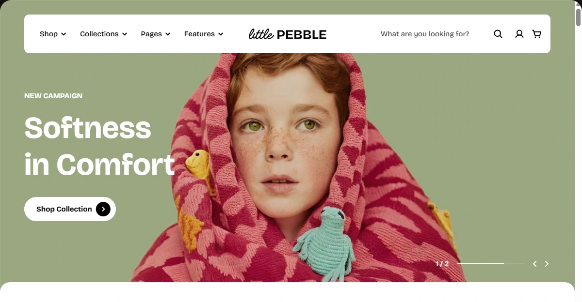
A homepage slideshow uses multiple visual panels to showcase different products, campaigns, or offers in the same prominent space. Each slide should communicate one clear message so shoppers can understand it quickly.
- Desktop: 1920 × 1080 px (16:9)
- Mobile: 1200 × 400 px (3:1)
- Tip: Keep the composition consistent across slides and avoid placing important elements too close to the edges, where different screen sizes may crop them.

How to Optimize Shopify Banner Images for Quality and Performance
Here’s what you’d check before uploading a banner.
Keep Banner Images Under 500 KB Where Possible
A good practical target is to keep a compressed banner under 500 KB when you can do that without noticeably hurting image quality.
This isn't a Shopify requirement. Shopify allows standard image uploads of up to 20 MB or 20 megapixels, whichever limit you reach first. That tells you what Shopify can accept, not what you should aim for on your storefront.
This matters especially for large homepage banners that appear as soon as someone lands on your store. Smaller files mean less data to load, which can help create a faster experience, particularly on mobile connections.
Choose the Right Image Format
The format you choose can affect both image quality and file size. Shopify supports common formats including JPEG, PNG, WebP, HEIC, and GIF for image uploads.
For most Shopify banners, I'd keep it simple:
- JPEG: Best suited to product photography, lifestyle images, and other photographs.
- PNG: Useful for transparent backgrounds, logos, or graphics with sharp edges.
- WebP: A modern format that can provide good quality at a smaller file size.
- GIF: Better for simple animated visuals rather than standard static banners.
- HEIC: Supported by Shopify, but less commonly used as the final format for storefront banners.
You also don't need to manually convert every image to WebP. Shopify's image CDN can deliver modern formats such as WebP or AVIF when the shopper's browser supports them.
Don't Upload a Much Larger Image Than You Need
Shopify can optimize how images are delivered, but that doesn't mean a huge original file is automatically a good idea.
If your banner only needs to display at a certain size, exporting a 5000-pixel-wide image when you don't need that resolution can add unnecessary weight to your workflow and source assets.
Start with a high-quality image that makes sense for the section you're designing. You want enough resolution to keep the banner sharp, without creating an unnecessarily massive file.
Let Shopify Handle Image Delivery
One useful thing about Shopify is that you don't have to manually create a different image file for every screen size.
Shopify's CDN can resize images and deliver appropriately sized versions to different devices. Modern Shopify themes can also use responsive image settings so shoppers aren't unnecessarily downloading the largest version of an image.
For merchants, the takeaway is simple: give Shopify a good-quality source image and use a theme that handles responsive image delivery properly.
You don't need to manage the technical side yourself unless you're making custom changes to your theme.
Don't Slow Down Your Main Hero Image
Your main homepage banner deserves special attention because it may be one of the first things a shopper sees.
If the hero image loads too slowly, it can make the whole storefront feel slow. At the same time, lazy-loading every image isn't necessarily the answer. Images that are already visible when the page opens generally shouldn't be treated the same way as images further down the page.
The good news is that a modern Shopify theme should handle much of this for you. The main thing I'd avoid is adding custom loading behavior that unnecessarily delays your most important above-the-fold image.
Don't Sacrifice Image Quality Just to Hit a Number
The 500 KB target is a guideline, not a rule.
A simple promotional banner with minimal detail may easily come in well below 500 KB. A detailed lifestyle image may need more to remain sharp and convincing.
If aggressive compression makes your product look blurry, creates visible artifacts, or makes text difficult to read, the smaller file isn't worth it.
The goal is to find the smallest practical file that still looks sharp on the storefront, rather than chasing an arbitrary file-size number.
A Quick Shopify Banner Image Checklist
Before uploading a banner, I’d check:
- Dimensions: Large enough for the section without being unnecessarily oversized.
- Format: JPEG for most photos, PNG when transparency or sharp graphics are needed.
- File size: Aim for under 500 KB where practical, but don't sacrifice quality just to reach it.
- Upload limit: Stay within Shopify's 20 MB or 20 MP limit.
- Delivery: Let your Shopify theme and CDN handle responsive image delivery.
- Loading: Avoid unnecessarily delaying your main above-the-fold banner.
The right Shopify banner isn't just about choosing 1920 × 1080 px and calling it done. The dimensions affect how your design fits the section, while the image quality, file size, and delivery behavior determine how that banner performs for actual shoppers.
6 Banner Design Mistakes That Can Hurt Your Store
A banner can look polished and still work against your store. The issue isn't always the image itself. Sometimes, it's the way the banner communicates with shoppers or fits into the overall shopping experience.
Here are some common mistakes worth avoiding.
Trying to Say Too Much in One Banner
A banner has limited space, so cramming in a headline, product benefits, discounts, shipping information, social proof, and multiple calls to action can make it difficult to understand at a glance.
Keep the message focused. A strong banner usually has one main idea and one clear action.
For example, instead of promoting a discount, free shipping, a new collection, and a seasonal campaign at the same time, choose the message that matters most for that part of the customer journey.
Designing for Desktop and Treating Mobile as an Afterthought
A banner that looks great on a wide desktop screen can become difficult to use on a phone.
Text may become too small to read, the product may lose its visual impact, or the CTA may no longer stand out when the available space gets narrower.
Don't just shrink your desktop banner and assume it will work everywhere. Check how the design translates to mobile and, when your theme supports it, consider creating a dedicated mobile version with a more suitable composition.
Using the Banner as a Substitute for Your Store Content
A common mistake is putting too much information into the image because it feels like an easy way to explain the offer. This can make the homepage feel crowded and leave shoppers with little reason to explore further.
Use the banner to grab attention and communicate the main value proposition. Let your product sections, descriptions, reviews, and other store content provide the details.
Making the Image More Important Than the Product
A visually impressive banner can actually distract from what you sell.
This is especially easy to do with large lifestyle images, heavy overlays, or elaborate graphics. If shoppers remember the banner but can't immediately tell what products are available, the design isn't helping much.
Keep the product and offer visually connected to the main message. The banner should create interest, then naturally lead shoppers toward the products.
Using Text That Becomes Difficult to Read
Fancy fonts, busy backgrounds, low contrast, and excessive text effects can make banner copy hard to scan.
Your headline should remain readable without requiring shoppers to stop and decipher it. Check the text against both light and dark parts of the image, especially when the banner uses a lifestyle photo.
If your theme provides text and button settings separately from the image, using those controls can also give you more flexibility than baking every word directly into the graphic.
Adding Too Many Banners to the Homepage
More banners don't necessarily mean more opportunities to sell.
A homepage filled with slides, promotional strips, and competing visual sections can make it harder for shoppers to know where to look first. Each additional banner should have a clear purpose rather than simply filling space.
Instead of adding banners whenever you have another message to promote, ask what each one contributes to the shopping experience. If two banners communicate nearly the same thing, one may be enough.
Final Thoughts
There’s no magic Shopify banner size that guarantees a better-performing store. What matters is how well the banner fits the section, communicates your offer, and holds up across the screens your customers actually use.
Use the dimensions in this guide as a starting point, but always check the final design in your Shopify theme. Keep the file lightweight, make the message easy to understand, and don't let a visually impressive banner distract shoppers from the products.

Rosie Doan is a Senior Content Specialist at TrueProfit with over 4 years of experience creating content for the ecommerce and SaaS industry. Having worked closely with Shopify merchants and ecommerce businesses, she has developed a deep understanding of the challenges store owners face, from growing revenue and acquiring customers to tracking performance, managing costs, and improving profitability.