Shopify Mobile Optimization Guide (2026): Increase Speed, UX & Conversions



Table of Contents
- 1. Step 1: Build on a Solid Foundation with Responsive Design
- 2. Step 2: Speed Up Your Shopify Store on Mobile
- 3. Step 3: Optimize Mobile UX and Interface Design
- 4. Step 4: Streamline the Mobile Checkout Process
- 5. Step 5: Optimize Content for Mobile
- 6. Why Mobile Optimization Directly Impacts Your Sales Performance?
- 7. Must-Have Tools for Optimizing Shopify Stores on Mobile
- 8. Final Thoughts
- 9. Shopify Mobile Optimization FAQs
Mobile commerce now drives the majority of online shopping traffic. If your Shopify store is not optimized for mobile, you are losing sales every day to competitors who are.
Shopify mobile optimization affects your Google rankings, conversion rates, and customer experience all at once. A slow or clunky mobile store pushes shoppers away before they even see your products.
This guide walks you through every step to optimize your Shopify store for mobile, from theme selection and page speed to checkout flow and ongoing testing.
In this blog:
- 1. Step 1: Build on a Solid Foundation with Responsive Design
- 2. Step 2: Speed Up Your Shopify Store on Mobile
- 3. Step 3: Optimize Mobile UX and Interface Design
- 4. Step 4: Streamline the Mobile Checkout Process
- 5. Step 5: Optimize Content for Mobile
- 6. Why Mobile Optimization Directly Impacts Your Sales Performance?
- 7. Must-Have Tools for Optimizing Shopify Stores on Mobile
- 8. Final Thoughts
- 9. Shopify Mobile Optimization FAQs
Step 1: Build on a Solid Foundation with Responsive Design
Before any advanced optimization, your theme and design structure need to be right. Everything else compounds on top of this base.
What Responsive Design Actually Means
Responsive design means your store automatically adjusts its layout to fit any screen size, whether a phone, tablet, or desktop. It uses flexible grids and CSS rules to reformat content for each device rather than building separate sites. This is the non-negotiable baseline for any modern Shopify store.


Adaptive vs Responsive design. Source: Kinsta
If you are new to how Shopify works structurally, understanding how Shopify's platform and storefront system are built is a useful starting point before diving into theme customization.
How to Choose a Mobile-Friendly Shopify Theme
Not all responsive themes perform equally well on mobile. When evaluating a theme, preview it on a real mobile device, not just the desktop demo. You should look for themes that load quickly, have clean navigation structures, and display product images clearly on small screens.
Shopify's free themes, particularly Dawn, are built with performance and mobile-first design as priorities. These are reliable starting points for new stores. Paid themes can offer more features, but always verify mobile performance before purchasing.

Key features to prioritize in a mobile-friendly theme:
How to Customize Your Theme for Mobile-First
Shopify's theme editor lets you adjust layouts, fonts, colors, and section visibility separately for mobile and desktop. Use these settings to hide desktop-only elements that add visual clutter or slow load times on mobile.
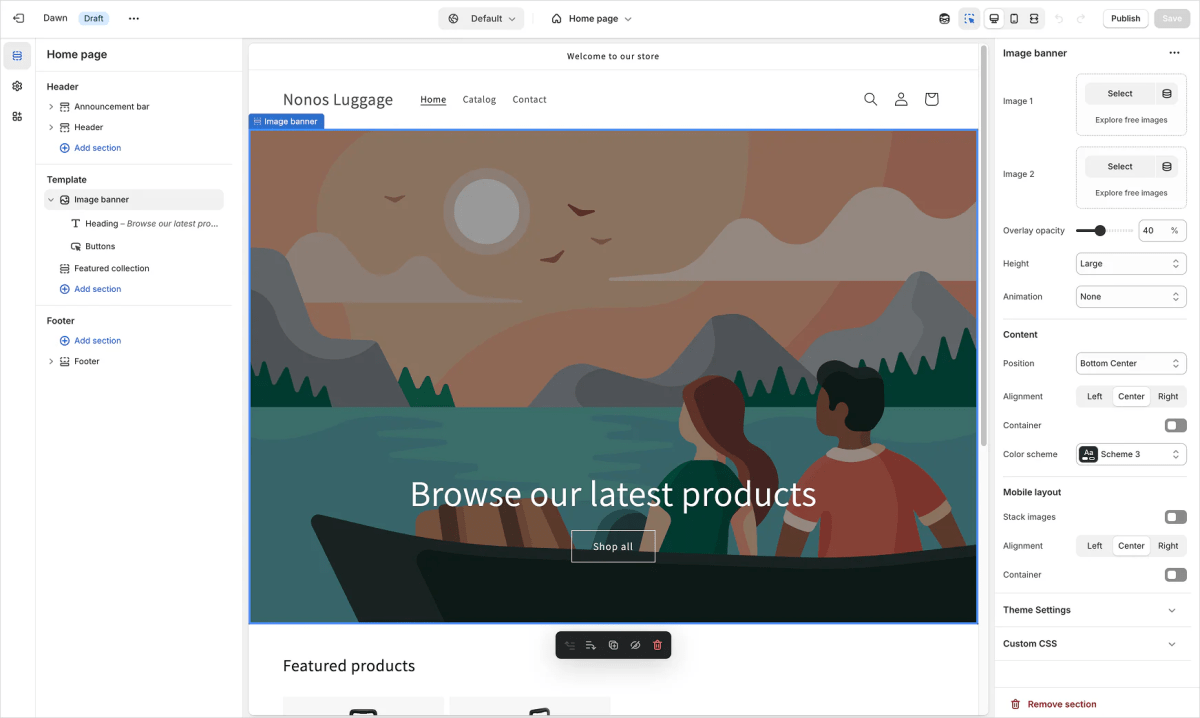
Source: Shopify Dev Docs
For more advanced adjustments, custom CSS can fine-tune spacing, font sizes, and element positioning on mobile without touching the desktop layout at all.

Step 2: Speed Up Your Shopify Store on Mobile
Page speed is the single most impactful factor in Shopify mobile optimization. The goal is to get your store loading in under three seconds on a standard 4G connection.
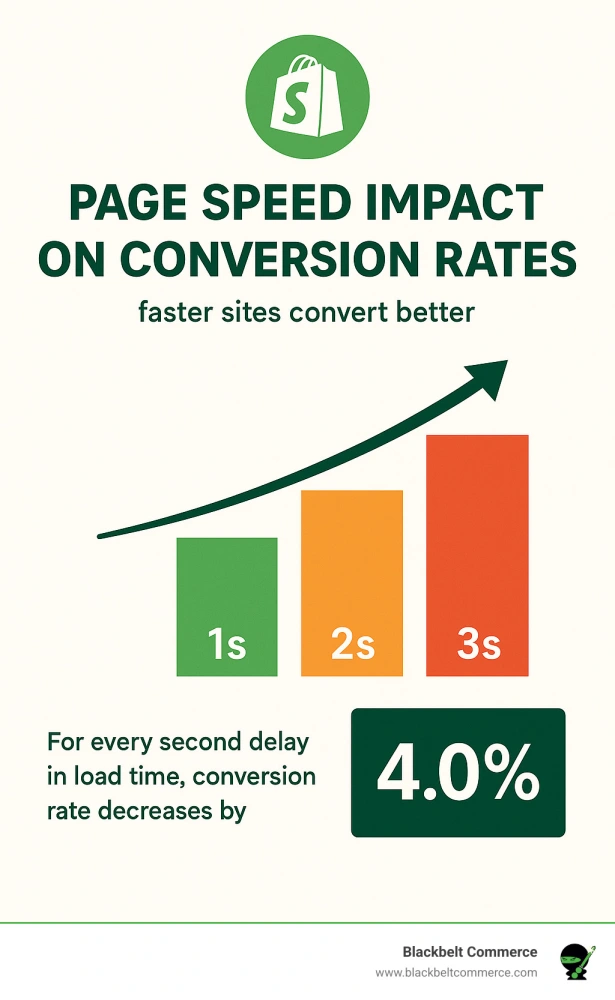
Source: Blackbelt Commerce
Optimize Images Before You Upload
Images are typically the largest files on any Shopify store. Unoptimized images are the most common cause of slow mobile load times.
Always compress images before uploading. Use WebP format, which delivers smaller file sizes than JPEG or PNG without sacrificing visual quality. Tools like TinyPNG or Shopify's built-in image processing handle this well.
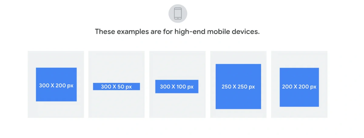
For banners specifically, use different dimensions for mobile and desktop. A desktop banner at 1440 x 500 pixels will appear distorted on a phone. The recommended mobile banner height is under 300 to 400 pixels, which keeps the image proportionate and fast-loading. Many Shopify themes allow you to set separate images for mobile and desktop directly within the theme editor's section settings.
Source: Shopify
Enable Lazy Loading for Off-Screen Images
Lazy loading delays the loading of images below the fold until the user scrolls to them. This dramatically improves initial page load times because the browser only loads what is immediately visible. Most modern Shopify themes include lazy loading by default. If yours does not, apps like TinyIMG can add it.
Take Advantage of Shopify's Built-In CDN
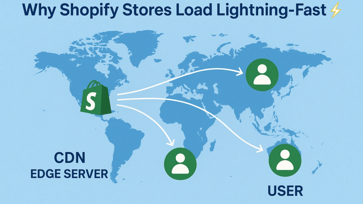
Shopify automatically serves images through its global content delivery network, which delivers files from servers closest to the user. Shopify also supports URL-based image resizing, allowing you to request specific image dimensions on the fly. This reduces unnecessary data transfer on mobile connections without any additional setup.
Source: LinkedIn
Audit and Remove Unused Apps
Each installed app can add extra JavaScript and CSS that loads on every page. Merchants frequently report significant speed improvements after removing unused apps. Audit your installed apps every quarter. If an app is not actively contributing to conversions, remove it.
Minify Code and Reduce Script Bloat
Minifying HTML, CSS, and JavaScript removes unnecessary whitespace and comments, reducing file sizes without changing how your store functions. Most Shopify themes ship with already-minified code, but third-party apps can introduce bloated scripts. Check your store's Network tab in Chrome DevTools to identify heavy scripts and evaluate whether each one earns its payload size.
Consider a Headless Shopify Setup
When should your Shopify store use a Headless Shopify setup?
A headless setup decouples your Shopify backend from the frontend, letting you build a custom front end using frameworks like Next.js for maximum performance. This approach suits high-traffic stores with dedicated development resources. It requires significant technical investment and is not the right move for most merchants.
Reviewing real-world headless Shopify implementations can help you assess whether the performance gains justify the cost for your store.
Step 3: Optimize Mobile UX and Interface Design
Speed gets users to your store. UX keeps them there and moves them toward purchase.
Simplify Navigation for Small Screens
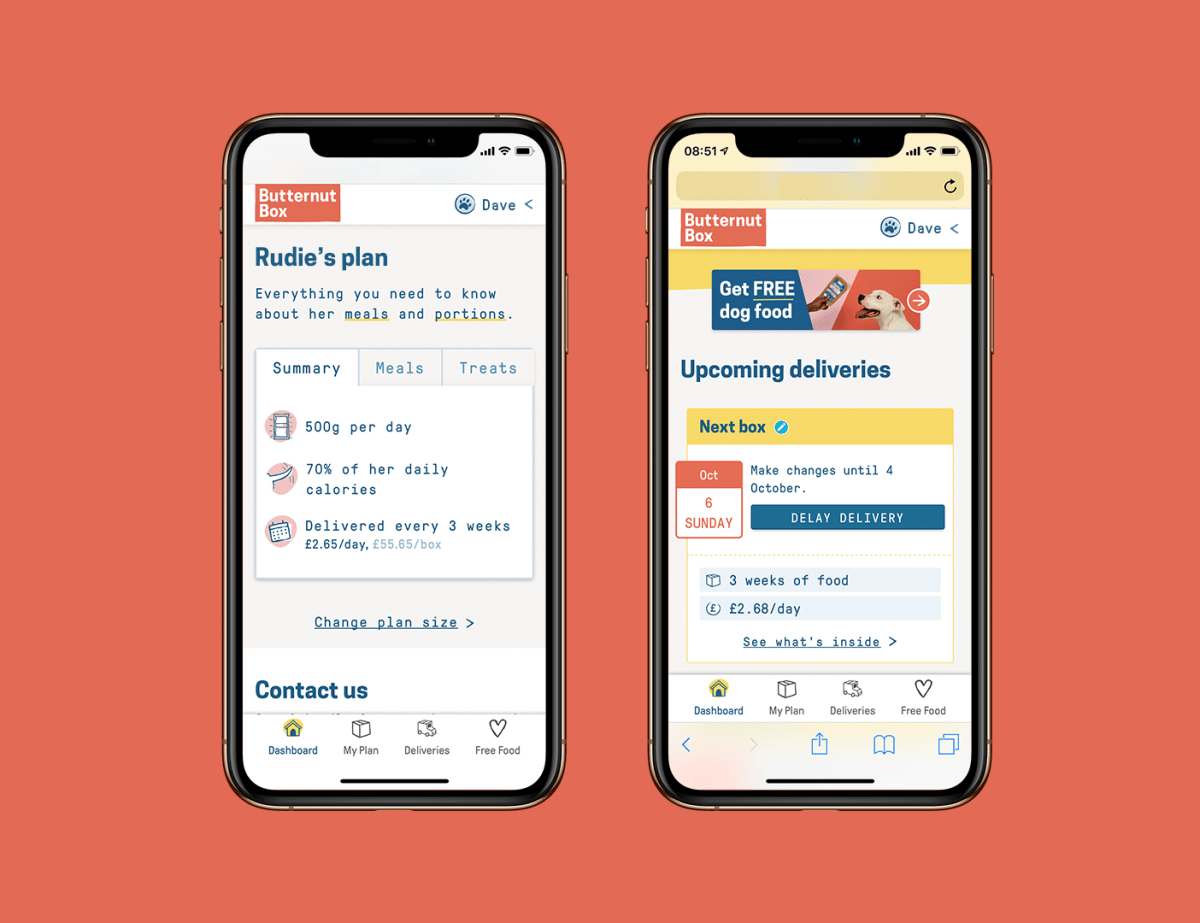
Mobile navigation should require as few taps as possible to reach any product or category. Use a hamburger or bottom navigation menu with no more than five to seven top-level items. Avoid dropdowns with many nested levels. If your catalog is large, a search bar that is always visible performs better than a deep menu structure.
Source: James Bovis
Design Product Pages for Fast Mobile Decisions
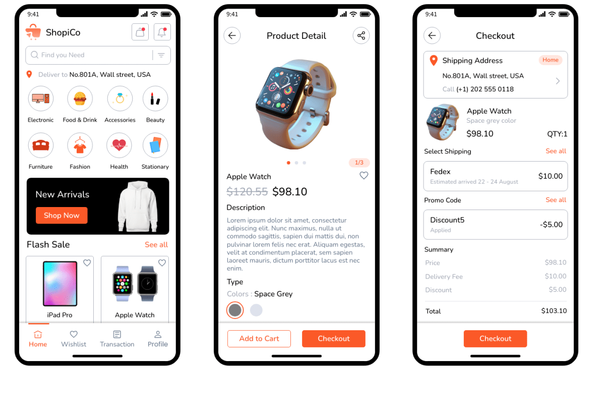
On mobile, shoppers make faster decisions with less screen real estate. Display product images in a swipeable gallery, put the price and Add to Cart button above the fold, and keep product descriptions scannable with bullet points. Avoid embedding large video files directly on product pages. Use a thumbnail-triggered player instead so the page does not auto-load heavy media.
Use Clear, Tappable Call-to-Action Buttons
Buttons should be at least 44 x 44 pt in size to meet Apple's and Google's touch target guidelines. Make Add to Cart, Buy Now, and checkout buttons visually distinct from the rest of the page. A sticky Add to Cart bar that follows the user as they scroll can meaningfully lift conversions, particularly on long product pages.
Source: MockFlow
Avoid Intrusive Pop-ups
Pop-ups that fire immediately on mobile cover most of the screen and are notoriously difficult to close on small devices. Google also penalizes mobile pages with intrusive interstitials in search rankings. If you use pop-ups for email capture or promotions, trigger them after 30 seconds or on exit intent, and make the close button large and obvious.
Use White Space and Respect Scroll Behavior
Cramming content onto mobile pages reduces readability and increases cognitive load. Use generous white space between sections. Keep line lengths between 50 and 75 characters per line for readability. Structure content to flow naturally with vertical scrolling, since mobile users scroll far more than they tap through menus.
Step 4: Streamline the Mobile Checkout Process
Cart abandonment is highest at checkout on mobile. Every form field you remove and every friction point you eliminate has a direct impact on completed orders.
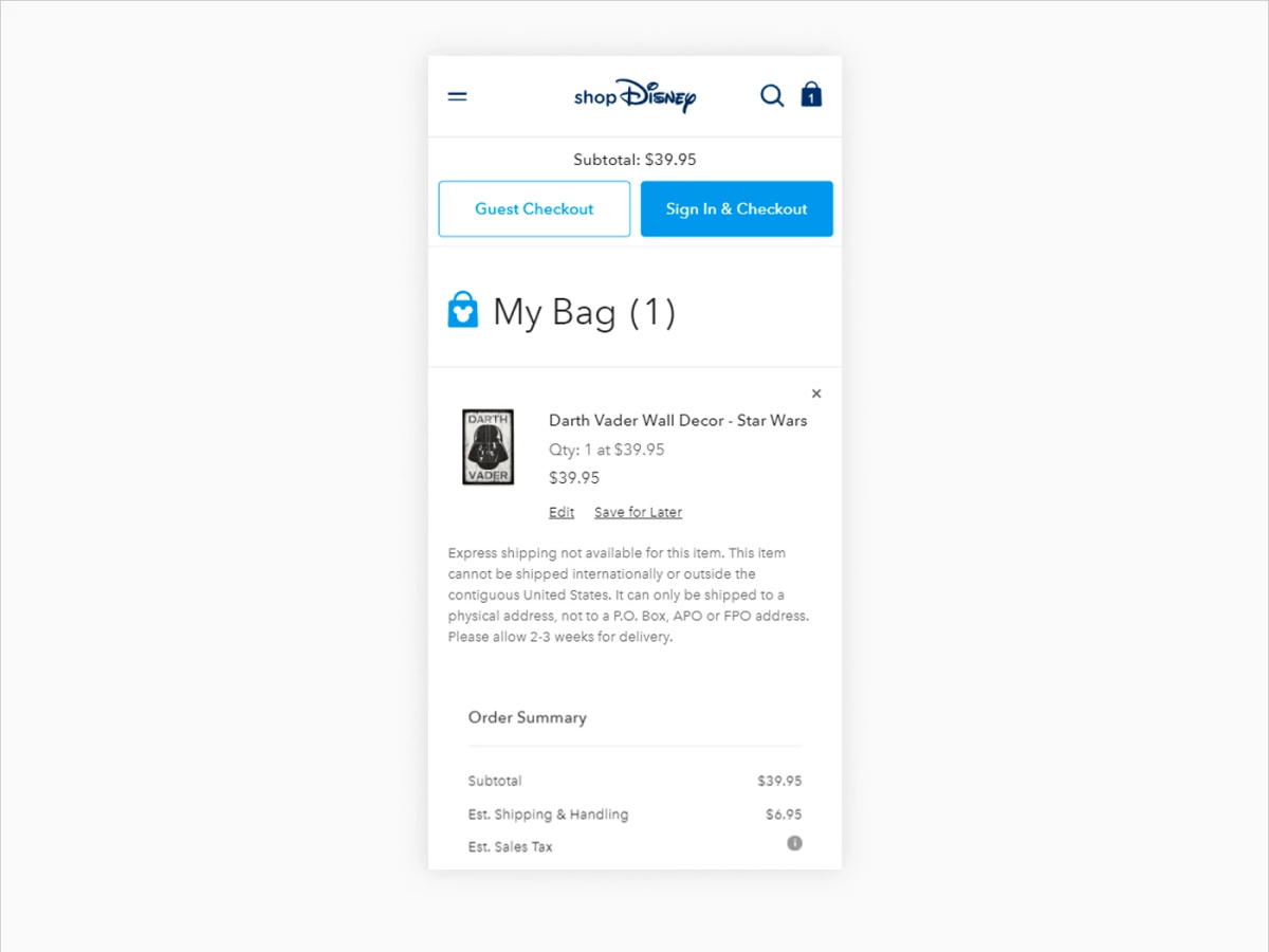
Offer Guest Checkout
Forcing users to create an account before purchasing is one of the most common reasons for checkout abandonment on mobile. Enable guest checkout and give account creation as an optional step after the order is complete.
Source: Agente
Enable Mobile Payment Options
Apple Pay, Google Pay, and Shop Pay allow customers to complete purchases in seconds without manually entering card details. These integrations reduce checkout to two taps for returning customers and can lift mobile conversion rates by a meaningful margin. All three are available natively within Shopify Payments.
Enable Autofill for Forms
Enable autofill for name, address, and payment fields to reduce manual typing. On mobile, typing is slow and error-prone. The fewer fields a user has to fill in manually, the higher the chance they complete the purchase.
Display Inline Error Messages
When a user makes a form error, show the error message directly next to the field in question, not as a banner at the top of the page. Inline errors tell users exactly what to fix without requiring them to scroll back up and re-examine a full form.

Step 5: Optimize Content for Mobile
Content that works on desktop often fails on mobile. Long paragraphs, auto-playing videos, and dense text blocks are the most common offenders.
Typography and Readability
Use a minimum font size of 16px for body text. Anything smaller forces users to zoom in, which disrupts the shopping experience. Keep paragraphs to three or four sentences maximum. Use subheadings frequently to break up longer sections and allow users to scan for the information they need.
If you use your Shopify blog as a content and traffic channel, studying high-performing Shopify blog examples gives you a practical benchmark for mobile-friendly content structure.
Video and Media
Use responsive video embeds that scale to screen width. Avoid autoplay video on mobile. Autoplay consumes data, fires without user intent, and often frustrates users who are browsing in public or without headphones. If video is important to a product page, use a static thumbnail with a play button overlay.
Why Mobile Optimization Directly Impacts Your Sales Performance?
Mobile is the default shopping behavior for most consumers. Many Shopify store owners report that 60 to 70 percent of their traffic comes from mobile devices, yet mobile conversion rates consistently lag behind desktop. That gap is money left on the table.
Slow Mobile Stores Lose Customers Immediately
Every additional second of load time increases bounce rates. 53% of mobile visitors abandon it if it takes more than 3 seconds to load.
Visitors on mobile are less patient than desktop users and far more likely to abandon a page that feels sluggish. Speed is not a nice-to-have. It is the foundation.
Google Ranks You Based on Your Mobile Site
Google uses mobile-first indexing, which means it evaluates the mobile version of your store to determine your search rankings. A desktop-optimized store with a poor mobile experience will rank lower in organic results, regardless of how strong your content is.
Checkout Friction Kills Mobile Conversions
Cart abandonment is highest during checkout on mobile. Tiny tap targets, multi-step forms, and missing payment shortcuts cause shoppers to give up right before purchasing. Fixing checkout alone can produce measurable revenue gains without touching anything else.
Mobile UX Is Still a Competitive Gap
Many Shopify stores still have significant mobile UX problems. Thoroughly optimizing yours means outperforming competitors who have deprioritized mobile, especially in crowded niches like fashion, beauty, and home goods.
Must-Have Tools for Optimizing Shopify Stores on Mobile
Shopify mobile optimization becomes much easier when you use tools designed for speed testing, image compression, and mobile conversion improvements. Here are some useful categories to consider.
Final Thoughts
Optimizing your Shopify store for mobile isn’t just a best practice anymore, it’s essential for eCommerce growth. As mobile commerce continues to expand, shoppers expect fast load times, intuitive navigation, and a seamless checkout experience directly from their smartphones and tablets.
But mobile optimization isn’t a one-time project. It’s an ongoing process of testing, refining, and improving every touchpoint of the customer journey.
By investing in responsive design, simplifying navigation, improving image and page performance, and continuously measuring how those changes impact conversions and overall store performance, you can create a mobile experience that not only meets customer expectations but also supports long-term business growth.

Lila Le is the Marketing Manager at TrueProfit, with a deep understanding of the Shopify ecosystem and a proven track record in dropshipping. She combines hands-on selling experience with marketing expertise to help Shopify merchants scale smarter, through clear positioning, profit-first strategies, and high-converting campaigns.